Aquarium Communication App
Designing a product, solving problems, and creating brand identity
The Loveland Living Planet Aquarium is a large non profit organization with over 100 employees in 10 departments. The administrators of this company sat down with our design/development team to discuss needs and wants for their future. As we discussed problems needing to be solved, one project became the focus, a web based communication app for use among employees, on site, and off (outreach team).
Current Methods of Communication
When asked what the preferred method of communication was, there was a variety of answers. Email, text, voice calls, social media, even personal visits; it was all over the place. We decided together that a web based communication app would be the best solution. Our team of two designers, and two developers got to work right away.
Pain Points
The administrators expressed frustrations about the current methods of communication between employees on and off site. Currently, there is not a centralized method in place, and the employees are all using whatever means they prefer. Email, text, phone calls, social media, or personal drop in. This causes problems, from mild frustrations over wasted time, to bigger issues related to exhibit repairs. The need for a consistent, streamlined, centralized form of communication accessible from the aquarium’s website was the product they desired to solve some of these problems. Our team requested three specific scenarios that arise in which communication becomes vital, and is difficult to achieve.
Scenario 1:
VP wants to send a message to all department admins about upcoming parking changes due to construction, all admins need to pass information on to their team members.
Scenario 2:
Admins want to send messages to team members as well as volunteers, but volunteers do not currently have living planet email addresses.
Scenario 3:
Staff member finds broken or damaged exhibit, this needs immediate attention, and multiple individuals need to be aware of the situation ASAP. An image taken with amobile device and attached to a message would be most helpful.
Project Proposal
As a team, we assembled a proposal for the aquarium to approve so we could move forward on the project. To visually assemble some information we had gathered about the current communication methods, pain points, and possible solutions, an experience map was constructed.
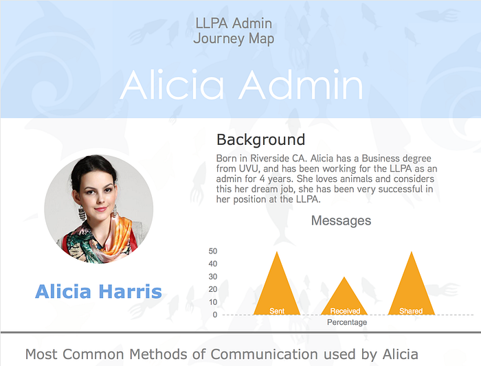
Research, sketch….Repeat
Research began with assessment of existing communication such as Slack and Flock. As a team, we concluded that what sets this app apart from other communication methods included:
1- The ability to access the app from the aquarium web site.
2- All members of the app would be aquarium employees and volunteers with living planet email addresses (the decision was made to provide volunteers with address or they could add their own).
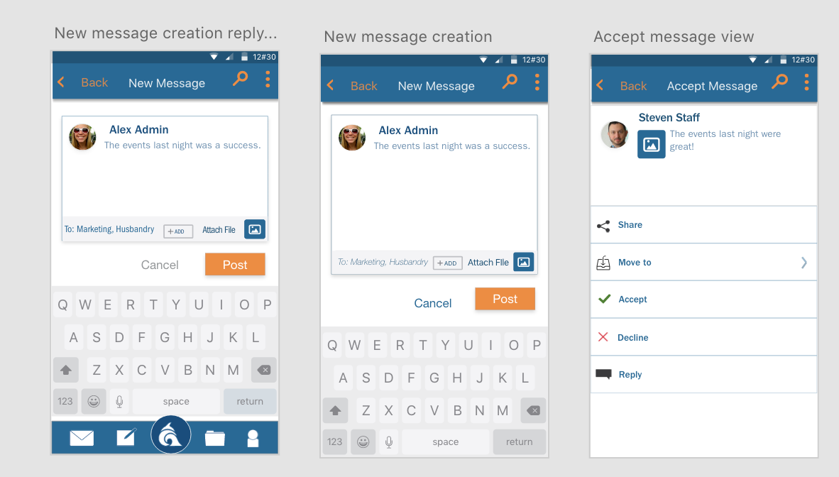
3- All admins would have the ability to approve or decline messages created for delivery by their team members.
Sketching was the first step in this process of creation, my fellow designer, Mati, and I sketched the desktop and mobile view simultaneously per the client. First, it was the client’s idea to make this app mostly usable on desktop while at work, but the realization that many uses for the app would require mobile access was determined, and out focus turned to mobile.
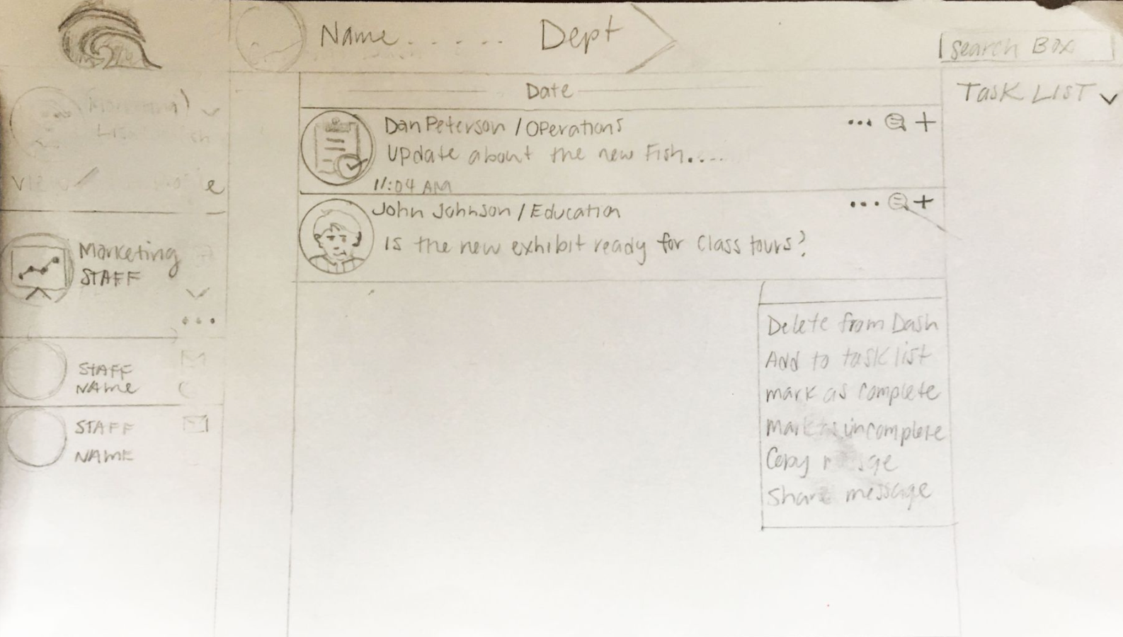
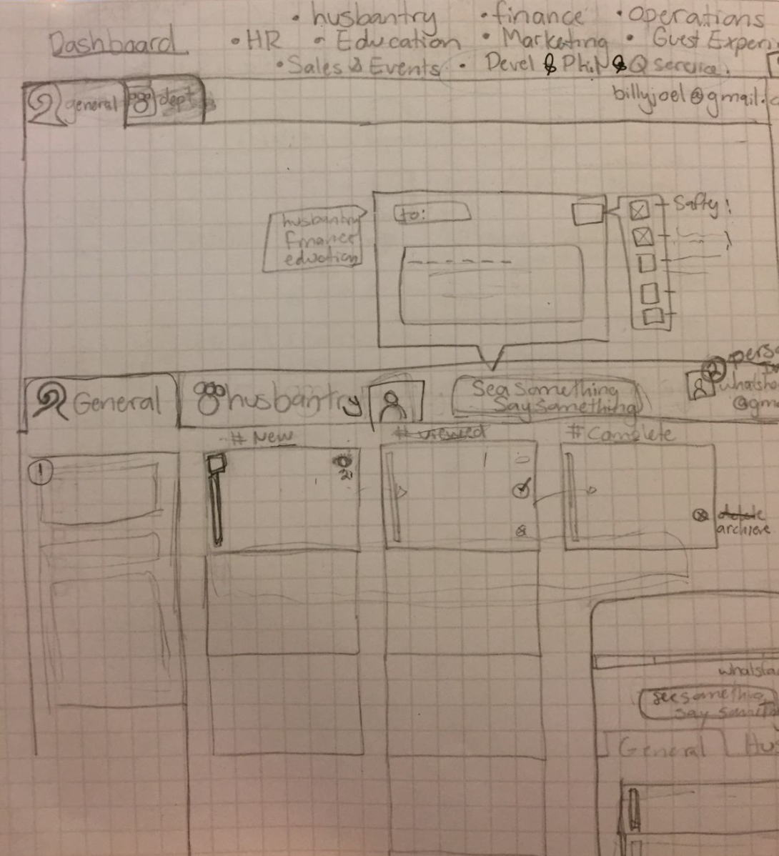

Sketching allowed us to attack our toughest issue(on paper)which was: how to make the approval process with admins as simple as possible, we don’t want to discourage features that the client really wants to implement. But, the idea of every message needing approval before it has the ability to be sent did seem like a hassle and admins might become frustrated by this and discourage them from using the app. We recognized that in the future, this feature would most likely be changed, we had to design with future iterations in mind.
Starting Simple with Interface Design
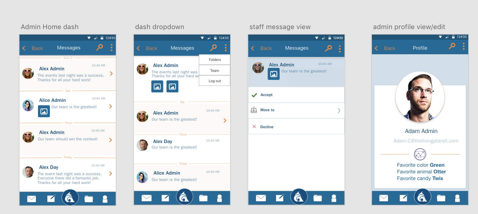
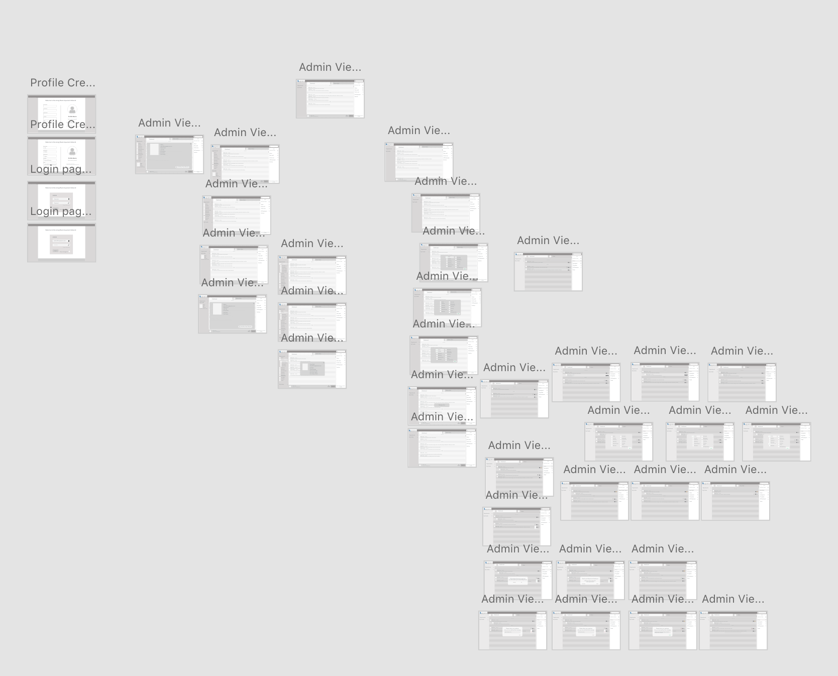
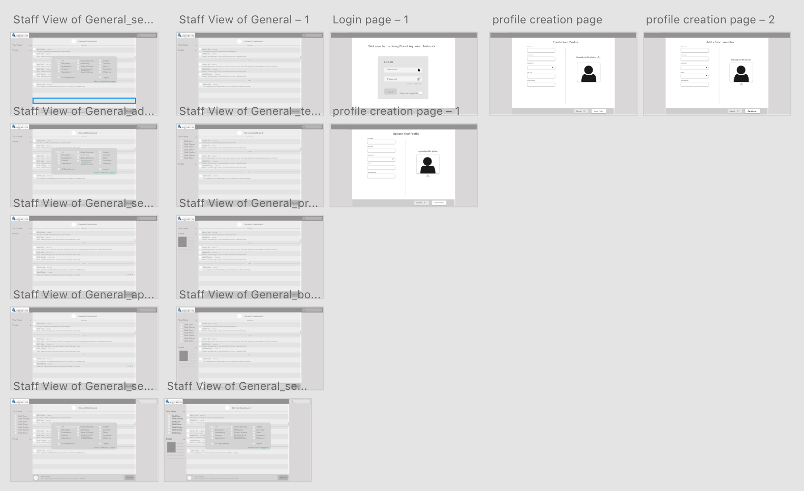
Simple design meant focusing on the features, and the usability of the app, our wireframes were very basic, placement of buttons, call to actions, etc. All of these items were kept in grayscale, color was only added where it made most sense. We broke the design up into two sections, staff and admins. Since these groups had different capabilities and would not look or function exactly the same. Staff view had the general dashboard that was viewable by that entire team, containing messages posted my all members of the team or shared by admins from other departments.
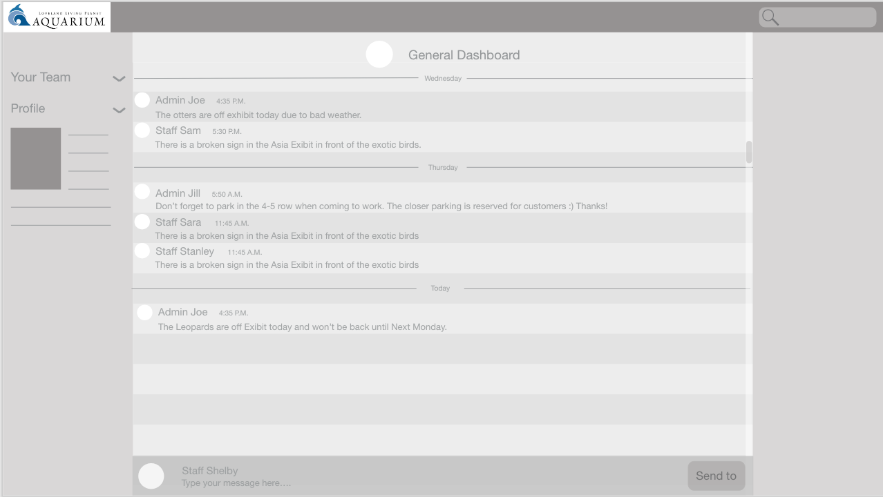
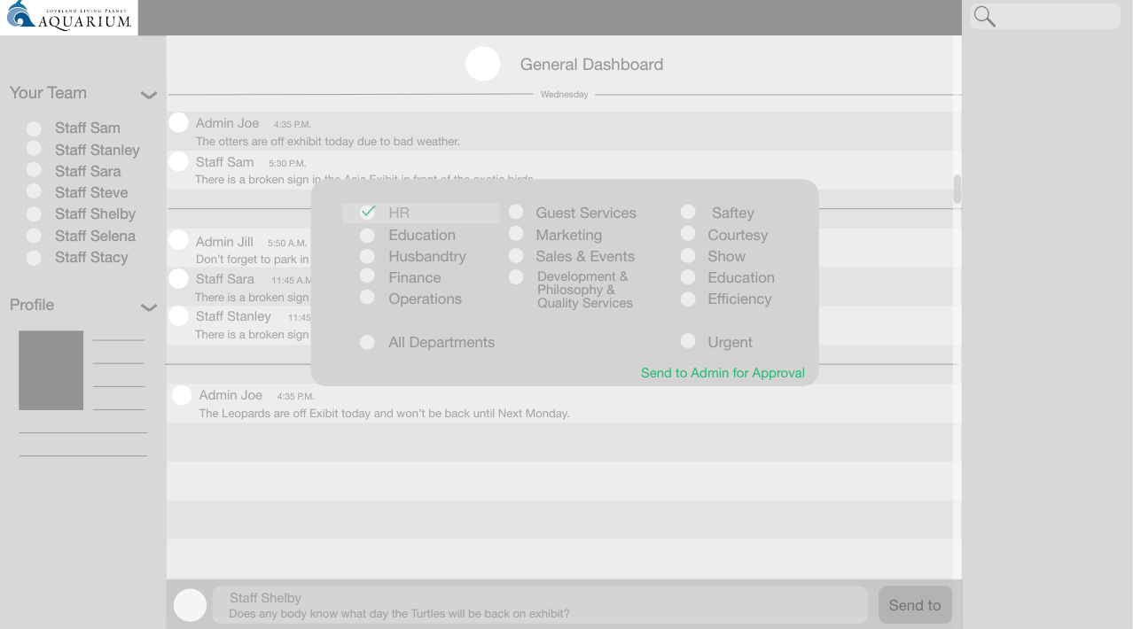
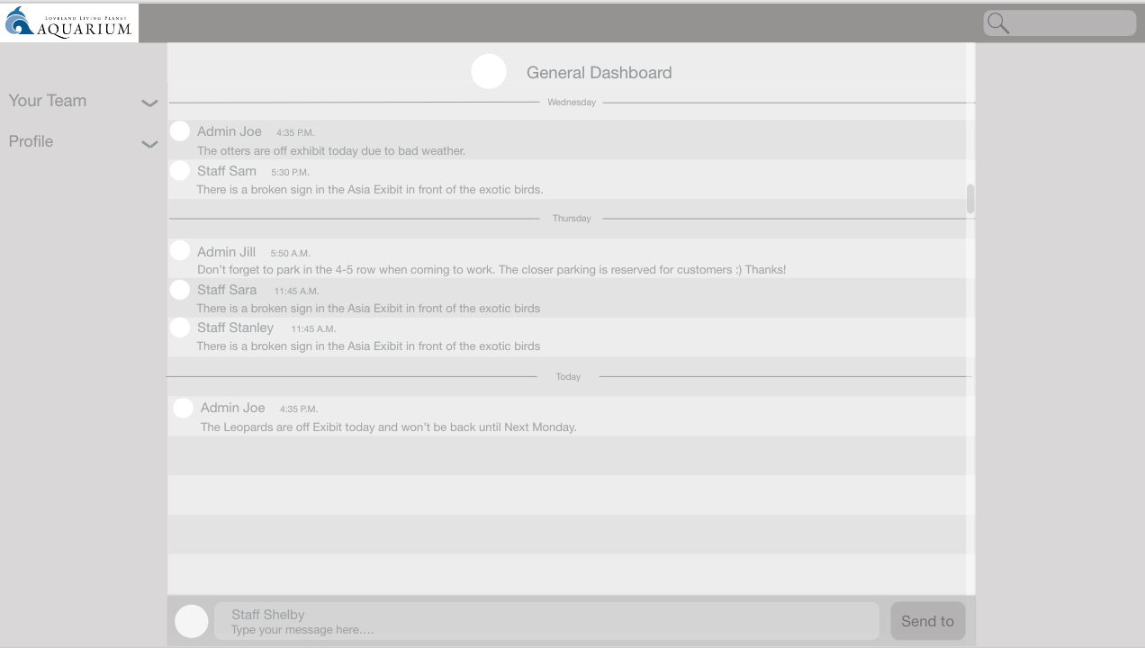
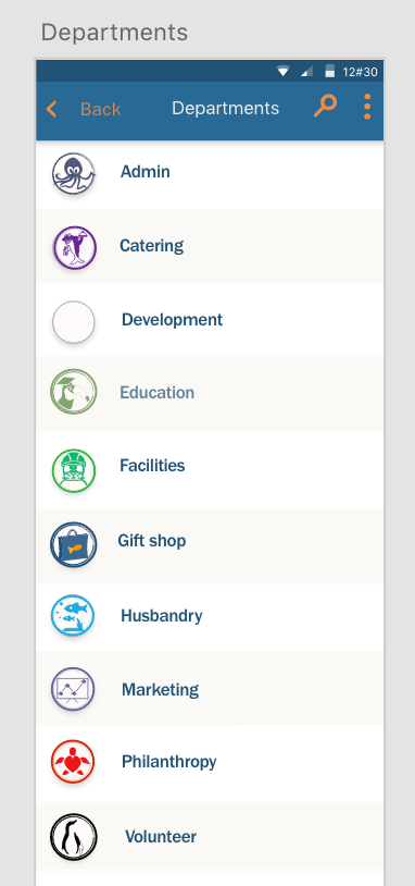
Admins had more capabilities, requiring much more thought in designs and iteration happened more frequently. We met again with our clients and gathered more information, at this point, we added our icons to the project. The idea was to create icons that represented each department. More about that part of the project can be found here. I decided to do user testing for the icons, which has become a whole project of it’s own.
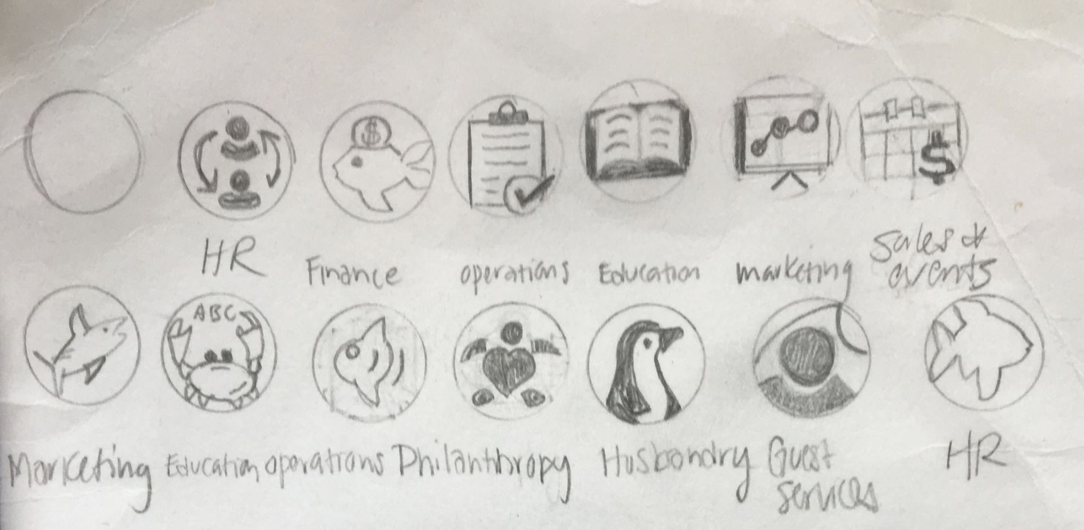
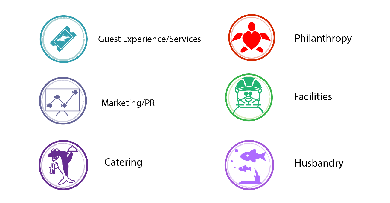
Sketching for mobile moved forward as our client recognized the need for those designs to be considered.
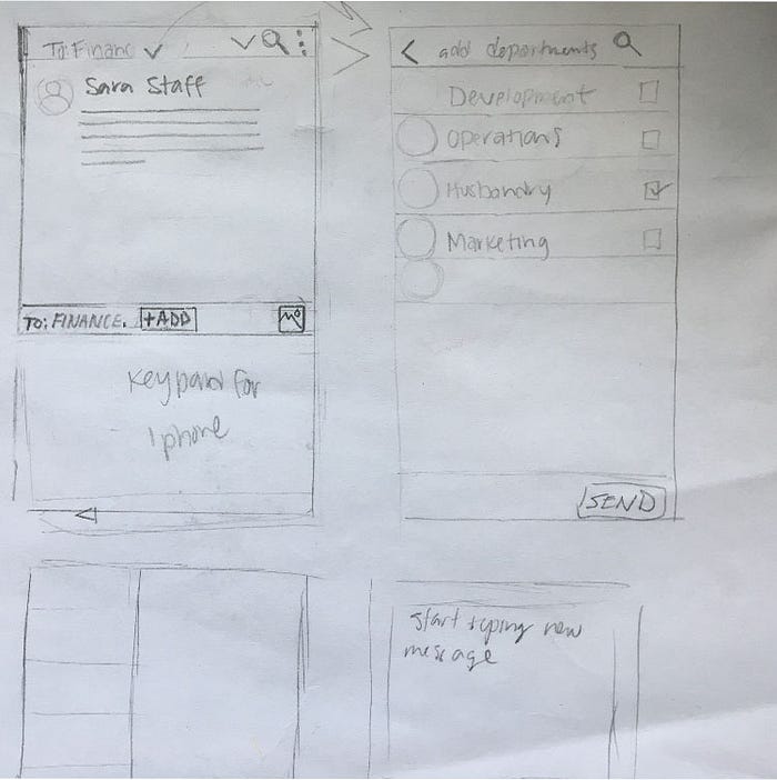
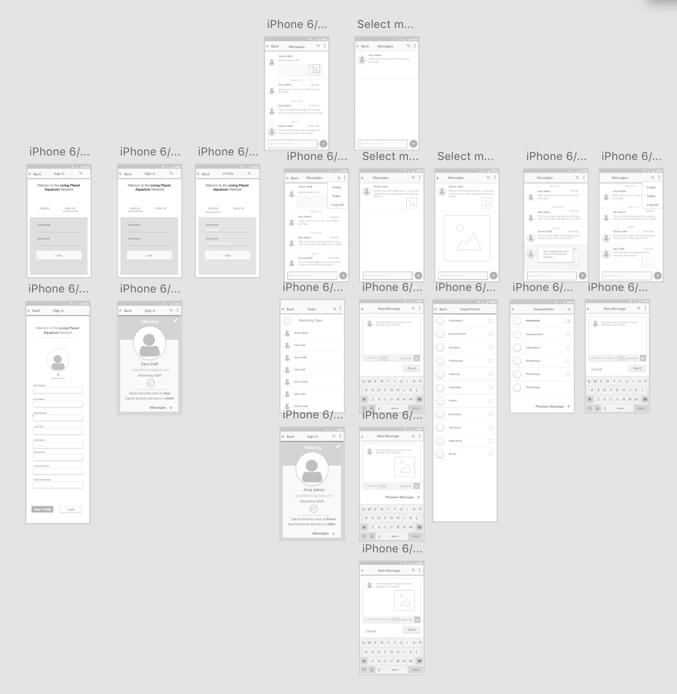
Wireframes for mobile
With this next step came some of the same issues to sort out with admin approval/decline process, as well as a new feature that admins expressed the need for in our 4th meeting at the aquarium. The new feature is an inbox with the ability to add multiple folders or catagories.
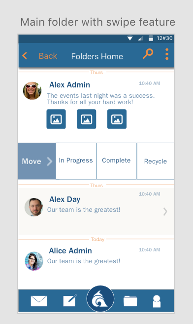
Adding the new feature meant adding a whole new set of steps to be considered: opening messages and moving them to an inbox, and then to a category or folder within the inbox. We designed a swipe feature that gave users the option to move a message to either the main inbox, or to a different inbox.
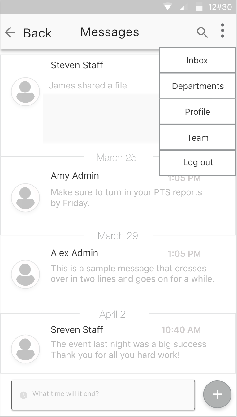
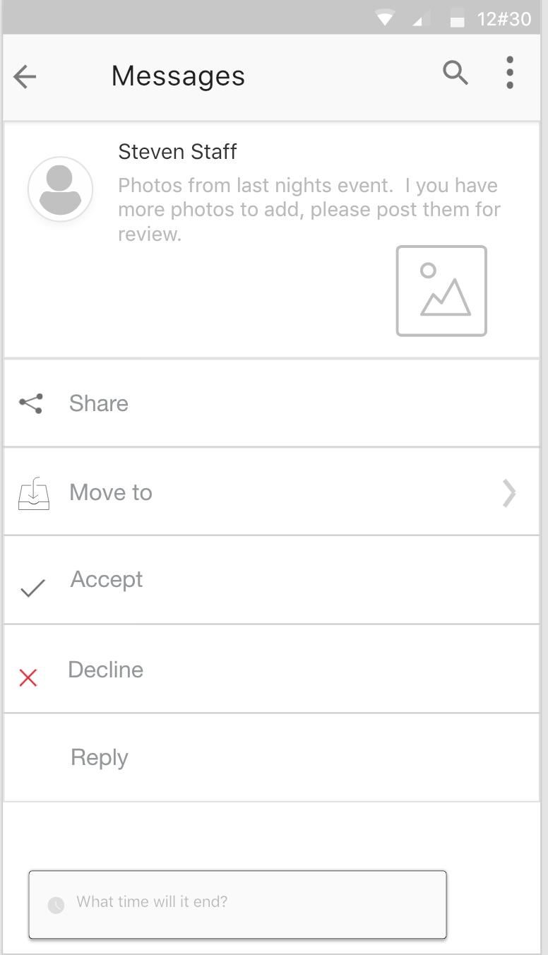
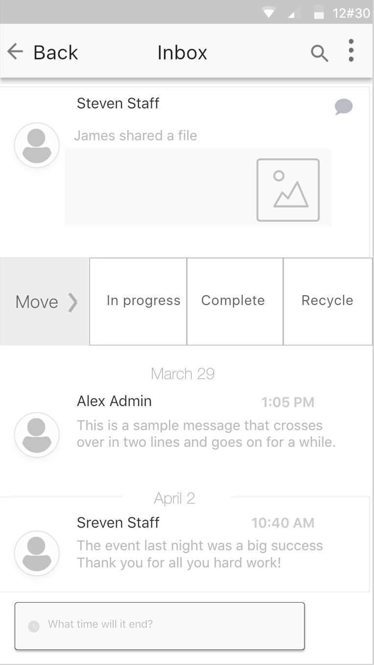
There is more than one way to access the inboxes and more than one way to move messages to these boxes. One consideration needed to be made is, how many folders or categories of inboxes can the system support, and how many will our design choices allow? Development has the final word on this subject, but for now the design can allow for multiple folders to be created and accessed. Log in, Profile creation, Profile view/edit, message creation, etc. All of these views have been added to the prototype that was created in Adobe XD.
Prototyping
We decided to use Adobe Xd for our prototyping for a few reasons: first, it is very easy to create content and especially at the stage we are at in this project (we have not styled yet). Second, transferring images and other objects between Photoshop and Indesign is seamless. Third, we can share out a link to the prototype with our client at the aquarium for approval and further testing. Our desktop staff and admin prototypes are still separate, and will remain separated per our client user testing; as well as our mobile designs.
Our team created a video recording for our clients, (mobile and desktop) as well as links to all prototypes for them to further assess and provide feedback. At this point, we received excellent positive responses from our client and admins that have looked at our designs and tested our prototypes.
Visual Design (making it look amazing!)
Designing the look (using surface comps) was the next step after perfecting our prototype and working through multiple iterations of mobile interaction design using wireframes. The aquarium admins desired that we use their own style guide to create the visual design of the app, with a few slight additions. We used the blues and orange as accent colors, and added a few basic colors to represent interactive capabilities (accept, cancel, selected states, etc).
